Module 4: Make Explanatory Visualizations
Module Overview
In this module, you'll master the fundamentals of data visualization in Python. You'll learn the anatomy of a figure, work with Matplotlib and Seaborn packages for creating visualizations, develop skills to identify misleading visualizations, and learn how to interpret different types of distributions. These skills are essential for creating accurate and effective data visualizations.
Learning Objectives
- Understand and work with the different components of a figure
- Create visualizations using Matplotlib and Seaborn packages
- Recognize and avoid misleading visualization practices
- Analyze and interpret various types of data distributions
Objective 01 - Identify Misleading Visualizations and How to Fix Them
Overview
Visualizing our data is one of the most important aspects of data science. We can tell a story, convey important information, and see our data in new ways with great visualizations. And on the other side, with poor visualizations, we can mislead and misrepresent. And so, it's essential to recognize the characteristics of bad data visualization so that we can avoid making the same mistakes.
Because the examples of bad plots and graphs are numerous, we'll focus on the most general characteristics and divide "bad viz" into the following categories: problems with axes, using the wrong graphic, cherry-picking, and not following conventions. Then, we'll give examples for each category and, more importantly, how to fix it. Or even better, how to avoid the problem in the first place.
Follow Along
For each of the above categories, we'll look at a bad example and the solution, or at least, a better way to improve the graph.
Problems With Axes
The axes of our plots should be precise and they should not make it easy to misinterpret the data. Some examples of problems with the axes parameters are: choosing to show only a part of the entire data range or selecting the axis limits in order to emphasize a particular aspect of the data.
The graph on the left, has the y-axis plotted but it doesn't show the zero baseline (y=0). Thus, it appears that llama ownership is increasing by a lot over the years. However, if we plot the same information over a wider range of the y-axis, the increase does not seem that significant.
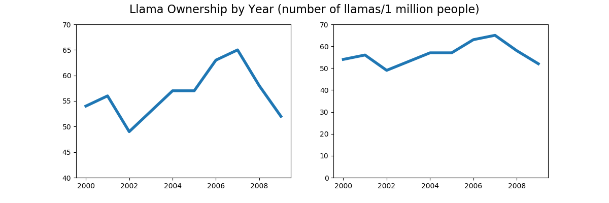
Not all plots need to show the axis with y=0, but in this example, it does give an impression of a greater variation in the data than there might exist.
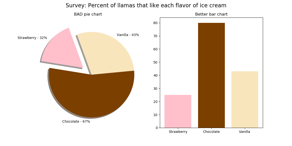
The Wrong Graphic
This section will introduce the infamous pie chart, something to remember fondly from primary school but not as a professional data scientist. Unfortunately, pie charts are difficult to get right because they can be easy to misinterpret, and it's hard to visualize the relationship between the different plotted variables.
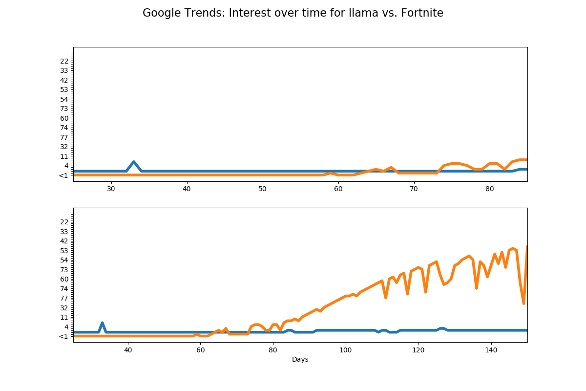
Cherry Picking
To cherry-pick means choosing the most beneficial parts of something; when applied to working with data, it means selecting only the data that shows what we want it to display. For example, in the following plot, the range of the x-axis shows a similar trend between Google searches for "llama" (blue line)and "Fortnite" (orange line). But, when we expand the x-axis range, we see that "Fortnite" becomes a lot more popular.
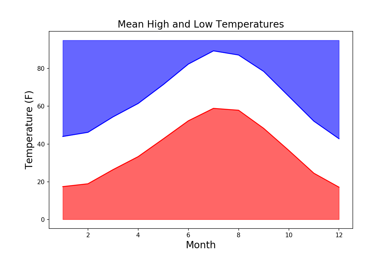
Not Following Conventions
The following plot shows the monthly mean high and low temperatures for a city. While we can see the value on each axis, the plot colors and style are misleading. Usually, warm temperatures are shown on a graph in orange and red colors, and cooler temperatures are shown in blue and purple colors. This graph shows the opposite (orange for cool, blue for hot) and uses distracting shading.
Challenge
Now it's your turn! You have two options for this part: either create your plot using a style similar to one of the above or find an example of a bad graphic (there are many, and it may be difficult to choose). Then, in as much detail as you can, identify what's wrong with the graph and how it should be displayed instead. (Don't just choose a graph from the links in Additional Resources but rather try to find one on your own.)
Additional Resources
Objective 02 - Use Appropriate Terminology When Referring to Parts of a Matplotlib Graph
Overview
When making visualizations, there are many different plotting libraries and styles of plots from which to choose. We've already worked with quite a few of them, including Matplotlib, seaborn, and the pandas DataFrame plotting methods. Both the pandas plot methods and the seaborn plotting library are on the Matplotlib library, so it will be helpful to go into more detail about using this excellent resource.
The Matplotlib library is popular, flexible, relatively easy to customize, and is easy to use with pandas DataFrames. There are many great tutorials on how to create plots with Matplotlib. One of the best resources is the Matplotlib documentation itself, especially the "Anatomy of a figure" graphic. The code used to produce this figure is available at the link; we're not going to include it here but instead work through a few specific examples to highlight certain plot parts.
Follow Along
We begin as we usually do by importing the libraries. We're using numpy to generate some data to plot
and the standard matplotlib.pyplot import syntax to create this plot. There are comments in
the code so
that you know what is generated on the plot.
# Import the libraries
import numpy as np
import matplotlib.pyplot as plt

# Generate the X and multiple Y values
X = np.linspace(0.5, 3.5, 100)
Y1 = 3+np.cos(X)
Y2 = 1+np.cos(1+X/0.75)/2
Y3 = np.random.uniform(Y1, Y2, len(X))

# Create the figure object with a size of 8x8 inches
fig = plt.figure(figsize=(8, 8))

# Create the figure axes with a single plot
ax = fig.add_subplot(1, 1, 1)

# Finally, plot!  b
# (we're choosing different colors here)

# Plot a solid magenta line, width=2
ax.plot(X, Y1, c='m', lw=2, label="magneta signal")

# Plot an orange dash-dot line, width=3
ax.plot(X, Y2, c='orange', lw=3, linestyle='-.', label="orange signal")

# Plot yellow circle markers with a green edge, line width=0 (not visible)
ax.plot(X, Y3, linewidth=0,
        marker='o', markerfacecolor='y', markeredgecolor='g')

# Set the title and the x- and y-axis labels
ax.set_title("Anatomy of a figure (modified)", fontsize=18)
ax.set_xlabel("X axis label")
ax.set_ylabel("Y axis label")

# Plot the legend using the labels defined earlier
ax.legend()

# Display the plot!
plt.show() uncomment to plot
<matplotlib.legend.Legend at 0x7fb140c7dc10>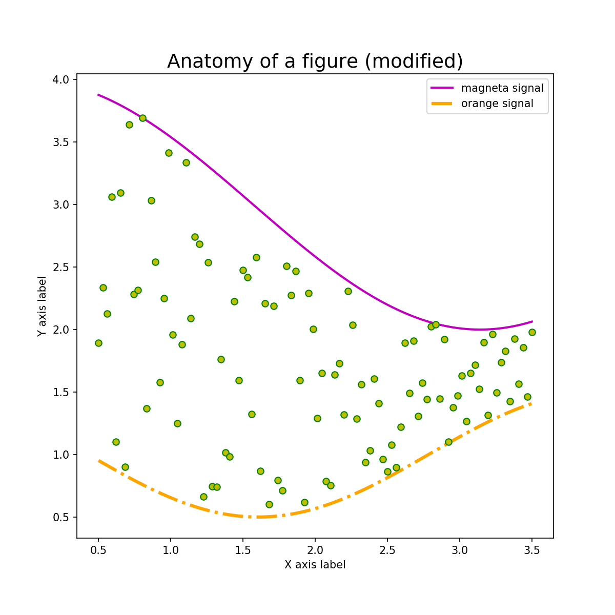
Challenge
Now it's your turn to modify and adjust the parameters on this plot. You can start by copying the above code or copy the code in the "Anatomy of a figure" example (linked above and in Additional Resources). It's usually easier to start with just a few lines of code, make sure you understand what they are doing, and then add additional features.
Additional Resources
Objective 03 - Differentiate Between Matplotlib Syntaxes - Pyplot and Object-Oriented
Overview
We've already introduced the basics for creating a Matplotlib figure and adding lines and markers, setting the titles and labels, and adjusting some parameters like the line width and colors. However, what you may not have noticed was the syntax used to create the figure.
There are two main ways to create a figure: using the pyplot API and the object-oriented API. We'll describe each method here and then illustrate using some examples in the next section.
Follow Along
Pyplot API
The Pyplot interface is also called the MATLAB-style, based on the program which inspired Matplotlib's creation. This interface is simple and easy to use; it's okay for simple plots when you don't anticipate needing to go back and add additional features.
We'll create a figure with two subplots, modeled after the Python Data Science Handbook examples.
# Imports
import numpy as np
import matplotlib.pyplot as plt

# Create the x-axis data
x = np.linspace(0, 10, 100)
y1 = np.sin(x)
y2 = np.cos(x)

# Create a plot figure
plt.figure(figsize=(8,8))

# Create the top subplot (plot within a plot)
# (2 rows, 1 column, position 1)
plt.subplot(2,1,1)
plt.plot(x, y1, color='b')

# Create the bottom subplot
# (2 rows, 1 column, position 2)
plt.subplot(2,1,2)
plt.plot(x, y2, color='orange')

# Add a title to the figure (not the subplots)
plt.suptitle('Pyplot Interface Example');

# Show the plot
plt.show() uncomment to see plot
Pyplot Interface example
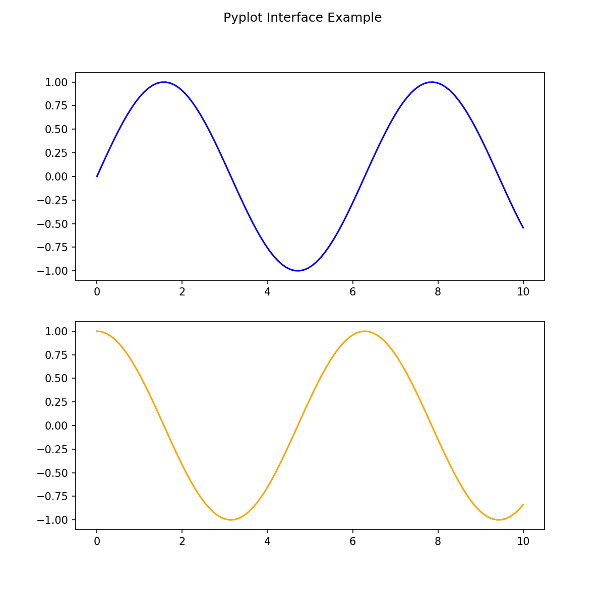
In the above plot, if we wanted to go back and add something to either the top or bottom, we'd have to
put that code right after making the plt.plot() call. This is because the
pyplot
interface keeps track
of the current figure plt.figure() and the current axes plt.plot().
Let's look at a different way to keep track of the figure and axes, which provides more flexibility in editing and adding things to your previously created figures.
Object-oriented API
Using the object-oriented interface we first create the figure and axes objects, and then use methods on those objects. Let's re-do the above plot and see how the two interfaces are different. We don't need to import a separate library—we are only using various features in the library. There are sevral comments in the code, so make sure to read through what each line does.
# Use the same data as above

# Create a grid of plots (notice the 's' in subplots)
# (figure, ax - two axes objects)
fig, ax = plt.subplots(2, figsize=(8,8))

# Look at the size of ax
print('Number of axes created: ', ax.size)

# Call the plot() method on each axes object
# object 1
ax[0].plot(x, y1, 'b')

# object 2
ax[1].plot(x, y2, color='orange')

# Add a title to the top axes object
ax[0].set_title('Object-oriented Interface Example');

fig.clf() # comment/delete to see plot
Number of axes created:  2

<Figure size 576x576 with 0 Axes>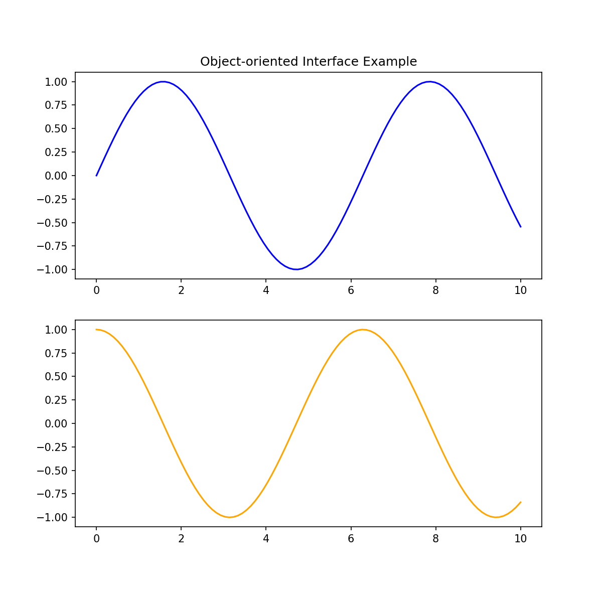
So now, when we want to add some feature to one of the axes objects, it's as easy as using ax[0] or
ax[1], and then calling the appropriate method. For example, we could add ax[0].set_ylabel('sin
function') to add the y-axis label for the top plot.
Challenge
Using both interfaces, create a single subplot using: plt.subplot(1,1,1) and
fig, ax = plt.subplots(2).
Either create some random data or add your data. For each interface, set the title, x-axis label, and
y-axis label. Also try to adjust the colors and line styles for each plot.
Additional Resources
Objective 04 - Use Matplotlib and Style Sheets to Control Basic Visual Aspects of a Plot
Overview
With the Matplotlib library, we can control many different options to determine the style of our plot. The fonts, colors, grid style, background, and axes parameters can all be changed to achieve the "look" we want. While a lot of these options are cosmetic, having nicely visualized data is also essential. The Matplotlib library has many different pre-defined styles that help customize your plots.
Style Sheets
The style sheets are easy to use, and once you have some practice data, you can plot the same data using various styles. Find a reference for the styles here. We'll go through a few examples in the next section. We can display the available style sheets with the following code:
import matplotlib.pyplot as plt
print(plt.style.available)
['seaborn-dark', 'seaborn-darkgrid', 'seaborn-ticks', 'fivethirtyeight', 'seaborn-whitegrid', 'classic', '_classic_test', 'fast', 'seaborn-talk', 'seaborn-dark-palette', 'seaborn-bright', 'seaborn-pastel', 'grayscale', 'seaborn-notebook', 'ggplot', 'seaborn-colorblind', 'seaborn-muted', 'seaborn', 'Solarize_Light2', 'seaborn-paper', 'bmh', 'tableau-colorblind10', 'seaborn-white', 'dark_background', 'seaborn-poster', 'seaborn-deep']Follow Along
As usual, we need to generate some data. The data used below comes from this "fivethirtyeight" Matplotlib example.
# Import the libraries
import matplotlib.pyplot as plt
import numpy as np

# Set the style-sheet
plt.style.use('seaborn-bright')

# Create the x variable
x = np.linspace(0, 10)

# Create the figure and axes objects
fig, ax = plt.subplots(figsize=(8,8))

# Plot the random data
ax.plot(x, np.sin(x) + x + np.random.randn(50))
ax.plot(x, np.sin(x) + 0.5 * x + np.random.randn(50))
ax.plot(x, np.sin(x) + 2 * x + np.random.randn(50))
ax.plot(x, np.sin(x) - 0.5 * x + np.random.randn(50))
ax.plot(x, np.sin(x) + np.random.randn(50))
ax.set_title("'seaborn-bright' style sheet");

plt.clf() # comment out to plot
<Figure size 576x576 with 0 Axes>
The default Matplotlib style colors and style can definitely be improved. Let's try a dark background next.
# Set the dark-background
plt.style.use('dark_background')

# Create the figure and axes objects
fig, ax = plt.subplots(figsize=(8,8))

ax.plot(x, np.sin(x) + x + np.random.randn(50))
ax.plot(x, np.sin(x) + 0.5 * x + np.random.randn(50))
ax.plot(x, np.sin(x) + 2 * x + np.random.randn(50))
ax.plot(x, np.sin(x) - 0.5 * x + np.random.randn(50))
ax.plot(x, np.sin(x) + np.random.randn(50))
ax.set_title("'dark_background' style sheet");

plt.clf() # comment out to plot
<Figure size 576x576 with 0 Axes>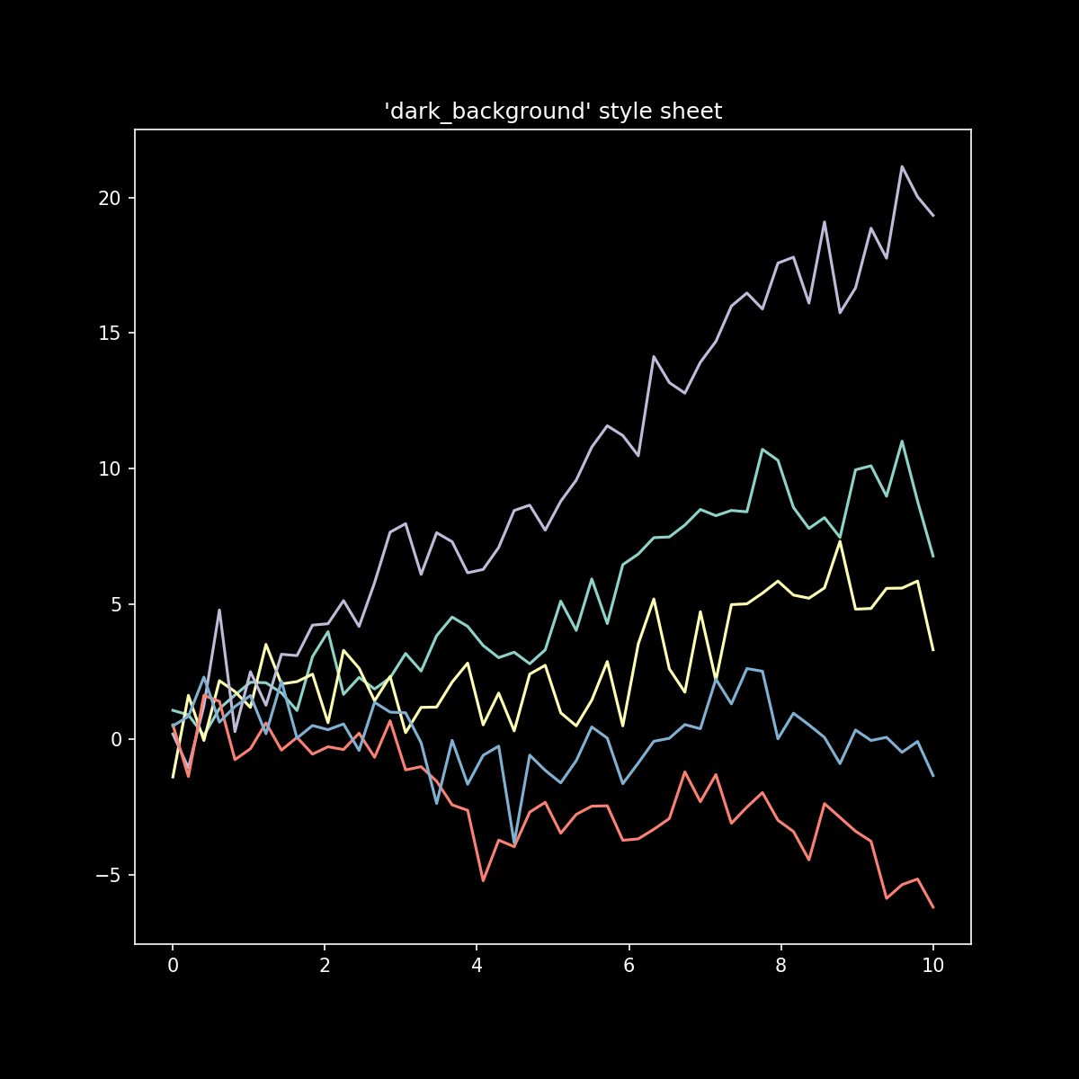
Challenge
Using the data created for this example, try using a few different style-sheet options. Remember to set the style before you create the figure.
Additional Resources
Guided Project
Open DS_114_Make_Explanatory_Visualizations.ipynb in the GitHub repository below to follow along with the guided project:
Guided Project Video
Module Assignment
Complete the Module 4 assignment to practice creating explanatory visualizations you've learned. The assignment covers effective visualization techniques, matplotlib functions, and the application of style sheets.